It is challenging to think of a new phase for a company. It brings challenges, objectives, goals, and, above all, a requirement for a team effort to understand current demands and face the nuances that the brand will take from now on.
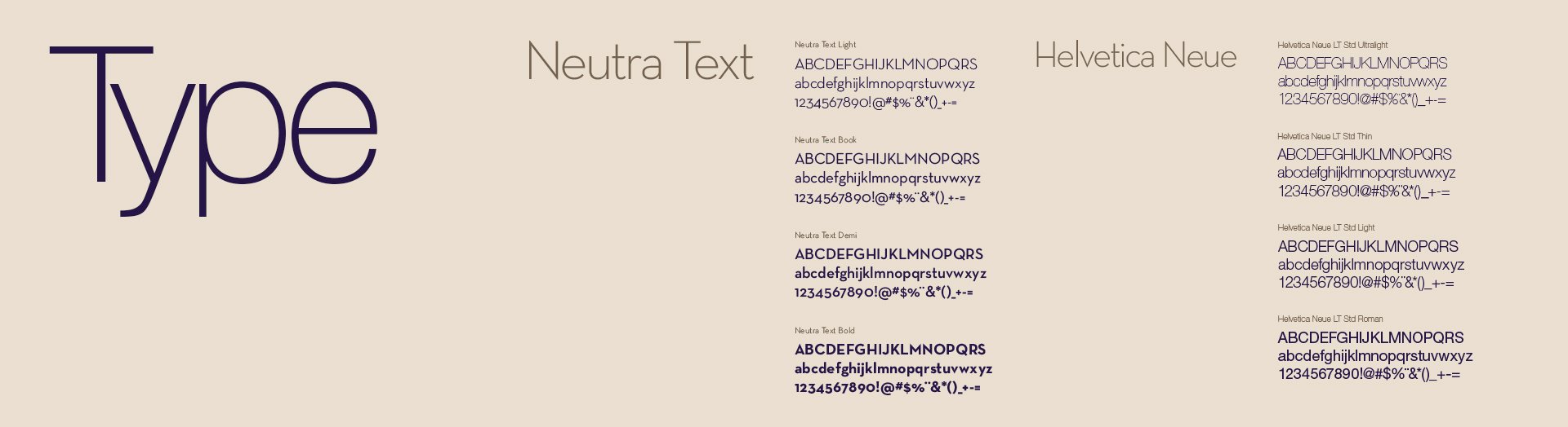
How to think of a visual identity for a company focused on Fashion Coaching? This was the question that intrigued me and guided me to create this new identity. After all, an identity that will represent a Fashion Coaching company must be, at the very least, elegant, sustainable, readable, and luxurious from the point of view of the public it will serve.
We had the challenge to make human beings, regardless of race, creed, color, or sexual preference, be empowered through their clothes. In a way that makes you feel the personal well-being that a new outfit and a new visual language can achieve.
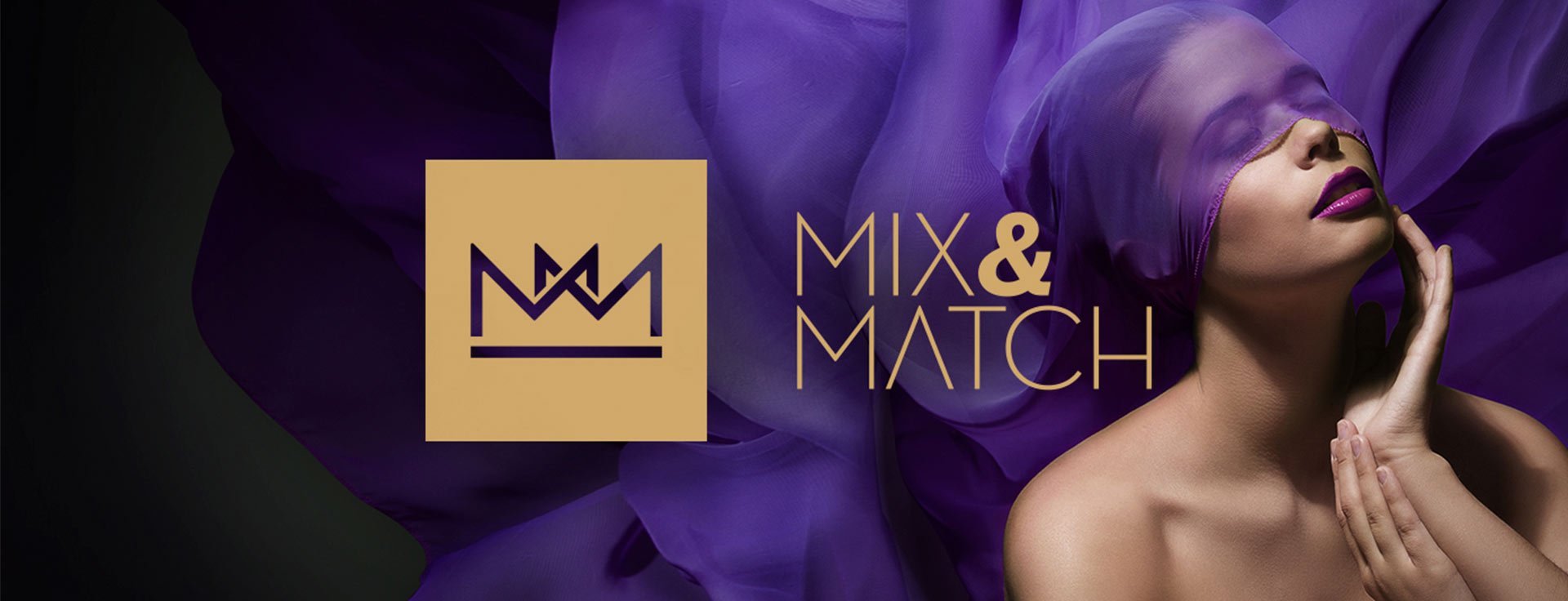
Therefore, my mission was to make Mix&Match convey the feeling that it would now be possible to achieve this empowerment.
É desafiador pensar numa nova fase para uma empresa. Traz desafios, objetivos, metas e, acima de tudo, uma exigência de esforço em equipe para entender as demandas atuais e o enfrentamento das nuances que a marca tomará daqui pra frente.
Como pensar numa identidade visual para uma empresa com foco em Coaching de Moda? Essa foi a pergunta que me intrigou e norteou para a criação dessa nova identidade. Afinal, uma identidade que representará uma empresa de Coaching de Moda deverá ser, no mínimo, elegante, sustentável, legível e luxuosa do ponto de vista do público que ela atenderá.
Tivemos um desafio de fazer com que o ser humano, independentemente de raça, credo, cor ou preferência sexual, seja empoderado através de suas vestimentas. De forma que faça-o sentir o bem estar pessoal que uma nova roupa e uma nova linguagem visual pode atingir.
Portanto, minha missão era fazer com que a Mix&Match passasse a sensação de que agora seria possível alcançar esse empoderamento.
The solution was to try to differentiate itself by analyzing the competition.
Most of the market at the time followed a very similar visual pattern. Black and white colors, sans serif fonts, and sensations such as luxury and refinement were commonplace.
A solução foi tentar se diferenciar mediante análise da concorrência.
A maioria do mercado, à época, seguia um padrão visual muito similar. Cores pretas e brancas, fontes sem serifa, sensações como luxo e requinte eram corriqueiras.
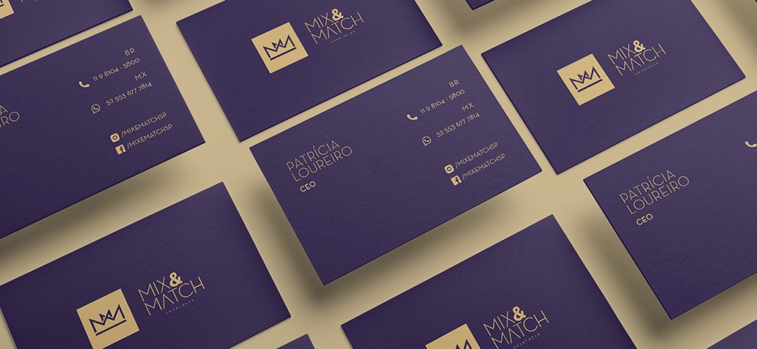
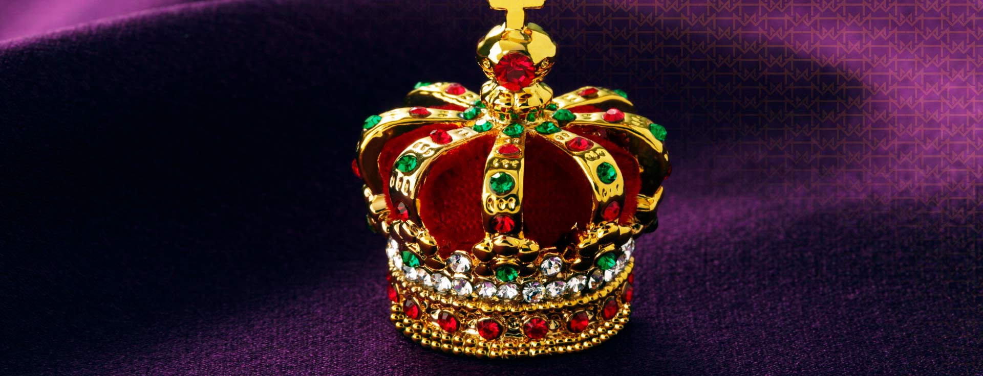
I sought a symbolic approach with the construction of a symbol that conveyed power, exclusivity, engagement, and trust.
At the same time, we created a visual system that was congruent with the client's needs and we had an approved and successful project
Busquei uma abordagem simbólica com a construção de um símbolo que transmitisse poder, exclusividade, engajamento e confiança.
Ao mesmo tempo criamos um sistema visual que fosse congruente com as necessidades do cliente e tivemos um projeto aprovado e bem sucedido